online bank for business clients [K&H web Electra]
manage your accounts with our fast and flexible electronic banking system, saving time and increasing your business efficiency
- easy to use, innovative design
- functionality tailored to your business needs
- online interfaces to support the digitalisation of your business on web and mobile
convenient
- modern interface
- customisable modules and filtering options
- also on mobile with the Electra24 application
- can be used simultaneously on multiple platforms
(web, mobile, client program)
flexible
- accessible from anywhere
- no installation required
- no browser extension installation required
secure
- K&H web Electra offers advanced security features
- access your business accounts through an encrypted HTTPS connection
- sophisticated approval and limit setting options
- can be used with the VICA application for access and transaction approval, even with biometrics
innovative interface
 innovative interface
 queries
 initiating new orders and managing registered orders
K&H web Electra main functions
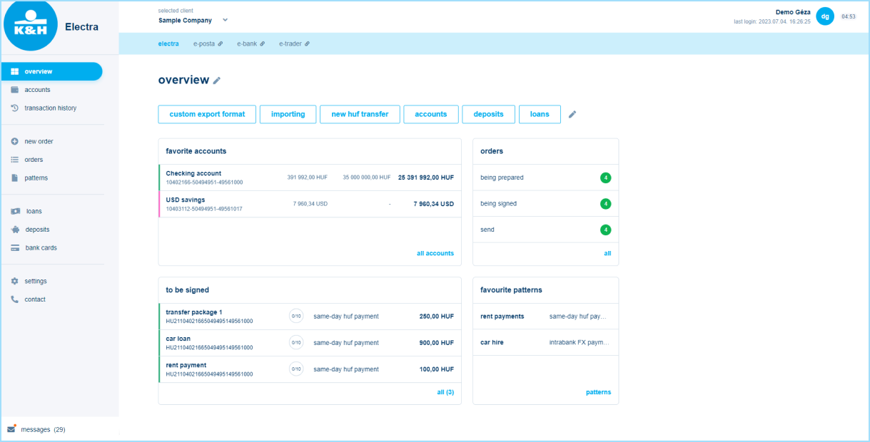
select company
Under the 'Selected company' heading, you can see which company's data is currently displayed. A drop-down menu allows switching to a different company, where you can now also see the date of the last login.
shortcuts
A reinterpretation of the old quick menu, the main page (also available for an overview menu) has 'blue caption buttons' showing the most common functions. In the new menu structure, these may be available in sub-menus with a few clicks, but can also be displayed on the home page to speed up daily work. They can be modified by clicking on the pencil icon at the end.
widgets
The 'cards', which are independent of the shortcuts, are widgets that help you personalise your home page (also available as an overview menu) and quickly access the most important functions and information. If the information is not sufficient or you have further work to do on a particular topic, you can automatically jump to the relevant menu item by clicking on the bottom of the topic. You can change the 'cards' displayed by default by clicking on the pencil icon. You can choose from sample views when editing, and the card will be loaded with data as soon it gets to the main page.
other banking applications
Have been placed uniformly at the top, on the left side of the light blue bar (e.g. ebank, eposta, etrader), unlike before, they are no longer on tabs and menu items. Items you don't have access to are shown in grey.
desktop/tablet/mobile viewing
You can also use K&H web Electra on different devices, the display will change depending on the screen size so that you can still enjoy the content. Due to the variable size, the menu is reduced to icons or items retrievable from three horizontal lines, but you can click to bring up the explanation. If the screen size on your mobile is no longer suitable to display, we recommend using e24 mobile application!
logout
The 5-minute time limit is still in force, in case of inactivity the user will be logged out. The previous operation, when only clicking on the main menu was perceived as an active activity, has changed, now more clicks on the screen are also considered as activity, and the user is not so easily kicked out of K&H Electra. Clicking on the countdown timer in the top right corner will still restart the clock.
click history
Within a session, the system remembers the activities within each main menu item until the user logs out, and if they change menu items, the last sub-menu used there will be displayed as default.
bank accounts
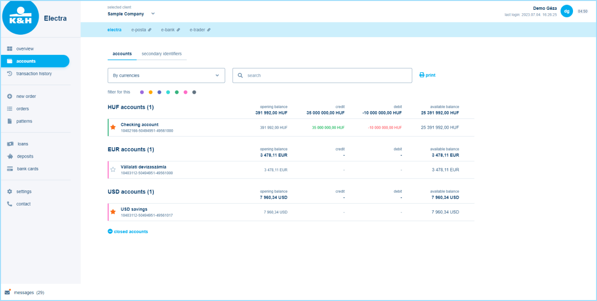
displaying bank accounts
It shows the transactions of the previous 24h summarised at the debit/credit value. It is now possible to filter by multiple data, e.g. by account number, amount, group (highlighted in colour), grouped by currency by default. When printing, the current filtered view is always displayed. You can mark your favourites with a star, this can also be displayed in the widget on the overview page.
managing bank accounts
Main details are shown on the home page, but clicking on the bank account will show more details and the related transaction history, by default for the last 30 days. The official K&H e-statement can also be accessed from here. The secondary identifier can also be recorded here.
accounts with other banks
This will now be located in a separate block under the bank accounts menu for those who have signed up for the service, instead of in the top bar.
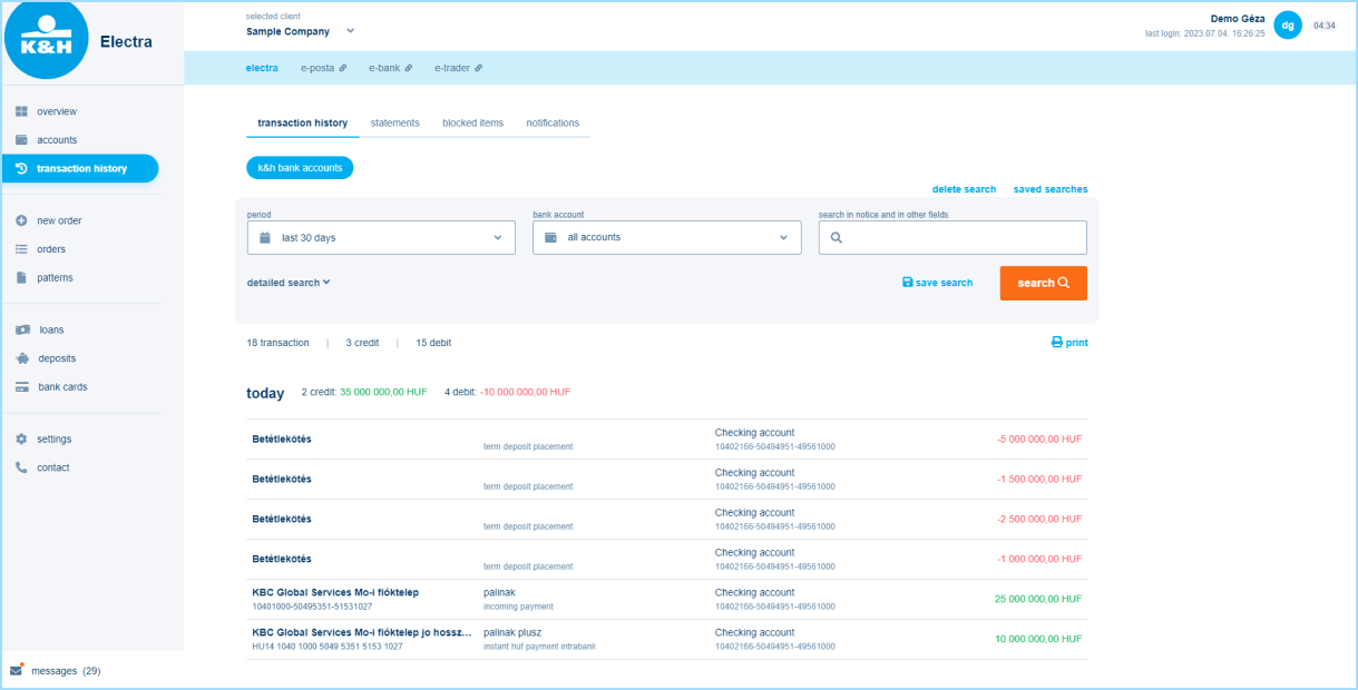
organising data
This menu item is similar to the previous ones, showing 30 days of data as a baseline, summarising the value of transactions by currency. The data can be further filtered by using the free word search or by clicking on 'detailed search'. The individually set filtering conditions can be saved by clicking on the 'Save search' button, so later on the query will be updated according to the previously set filters, which can be easily exported.
statements
This has also been moved under the transaction history menu item. The same functions are available as before, with the same export and print options. The 'last statement' button will be updated and the last statement will be available for all accounts without date setting (for a period of time defined by individual contract).
blocked items
This has also been moved under the transaction history menu item. The previous initial grouping by bank account was eliminated; in the new display all items are listed at once and data can be grouped according to individual needs using separate filtering options.
This is where you'll soon see the items managed in queues.
notifications
This has also been moved under the transaction history menu item. There are no changes in the notifications themselves, the export and print functions remain the same, only the display is different. In the new interface, clicking on the menu item will display the data for the last week by default and you only need to enter the date if you want to change it.
new order
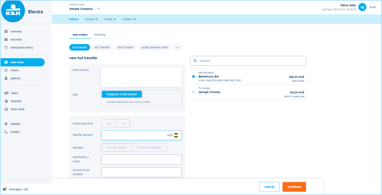
transfers
A new, dynamic interface to help you fill in the fields. The source account is automatically filled in by the system (this can be changed by clicking on it), the beneficiary and the amount are offered as partner templates in the right sidebar, and by selecting them, all the already existing saved information is pre-filled in the fields. Not all fields are immediately visible on the interface, which starts with the mandatory and most frequently used ones, all additional fields can be selected by ticking a checkbox. A new feature is that after recording, there is a data check before immediate submission/batching.
orders
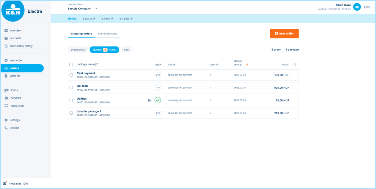
Signing orders
The signature process has not changed. A number in a circle next to the sign/send to bank text indicates how many items are still to be signed. Next to each order you can also see how many points the order is signed with at that moment, e.g. 5/10. After signing, orders can be submitted to the bank one by one or more than one at a time. If the details of an order are not correct or there was a change, it can still be returned for preparation.
interpreting status
Previously, the system showed a kind of end status, so if a batch was 9/10 successful but 1/10 failed, the status was unsuccessful. In the new display (under sent to bank), the status of each part within the batch is shown on the interface. No status feedback is shown for group orders, it can be viewed in the notification.
templates
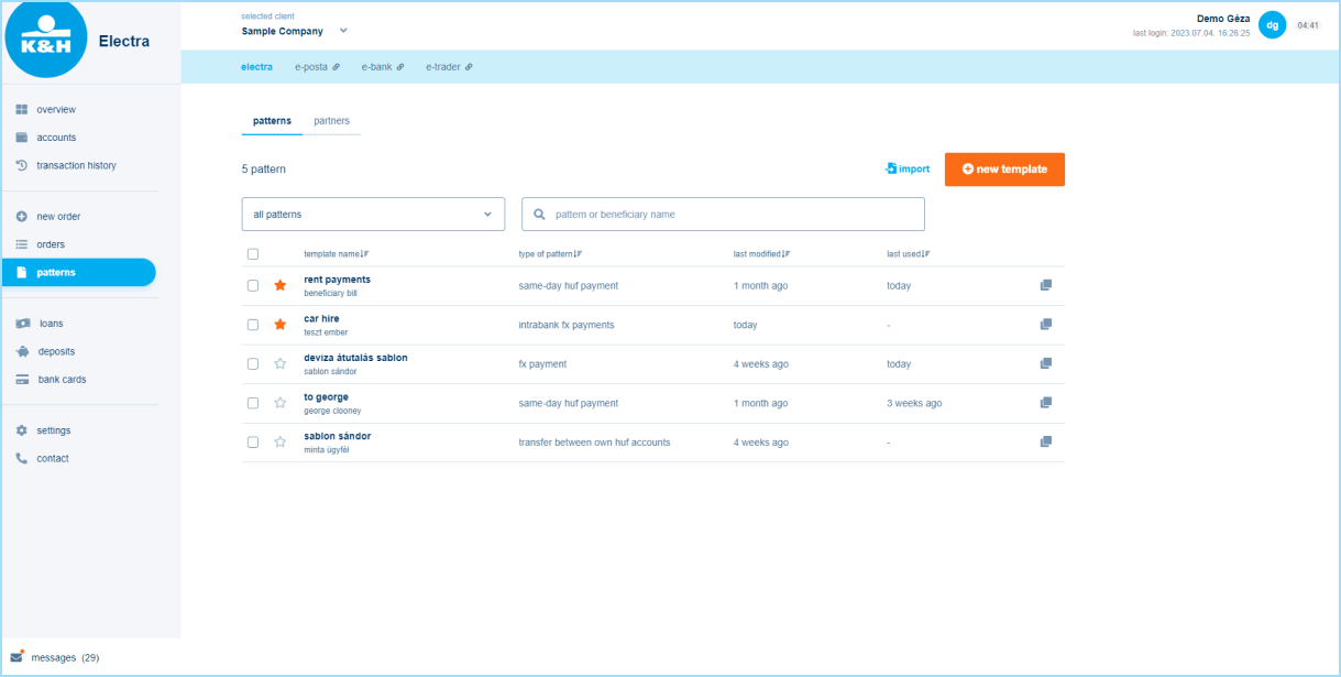
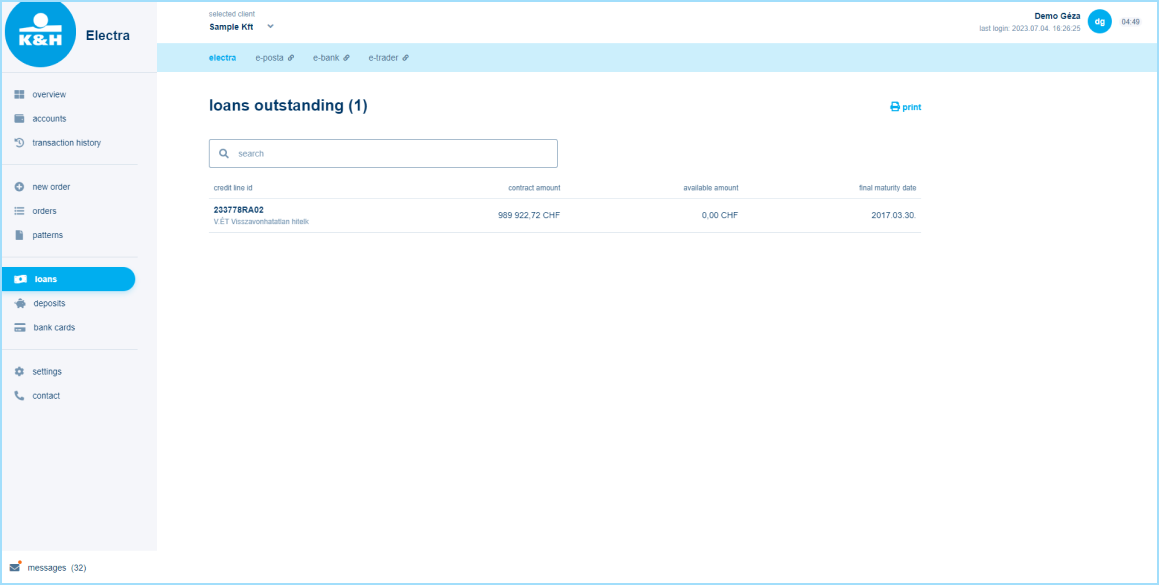
loans
credit line and disbursements
The top block shows the contractual credit line and related information, while the next block, called Loan, shows disbursements. If there are principal receivables due in the 7 days following the day in question, they are also displayed at the top of the block, aggregated by currency.
credit history
The history is shown at the bottom of the page, where data can also be filtered by credit ID.
deposits
displaying deposits

Clicking on the menu item will display all your active deposits. You cannot change their order, but you can search in the block marked with a magnifying glass at the top using a free-text filter.
cancellation
This function is still available, you will find a button for it in the top right corner.
bank cards
managing cards
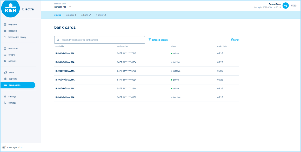
Cards are displayed in a list, sorted according to the data displayed (cardholder name, card number, status, expiry date), but you can also filter them using a detailed search. By clicking on a card, data can be viewed and modified according to the user's rights: the card can be activated, daily limits can be set, and security data can be entered.
settings
items that can be managed in Settings

In this menu item you will find the following sub-menus: access rights management, individual format management, initial account numbers, activity log.
custom format
This sub-menu can still be found as a sub-menu in Settings. Exports and imports are separated, and it is still possible to create new ones or modify existing ones. The order of the fields in the data row can be changed by drag&drop, where X at the end of the rows indicates the rows that can be changed; rows without an x indicates that it is a mandatory field.
initial account numbers
The interface where the default account can be set for different order types is still located under the Settings menu item.
activity log
Previously it was the View log sub-menu; here the main activities of the user are recorded, which can be filtered and sorted by user, event, time.
language setting and customisation
Previously they were in Settings, but they have been moved to Profile Settings, which can be accessed by clicking on the name at the top right. All settings for individual users are shown here, e.g. rights, authentication tools.
contact/messages
contact
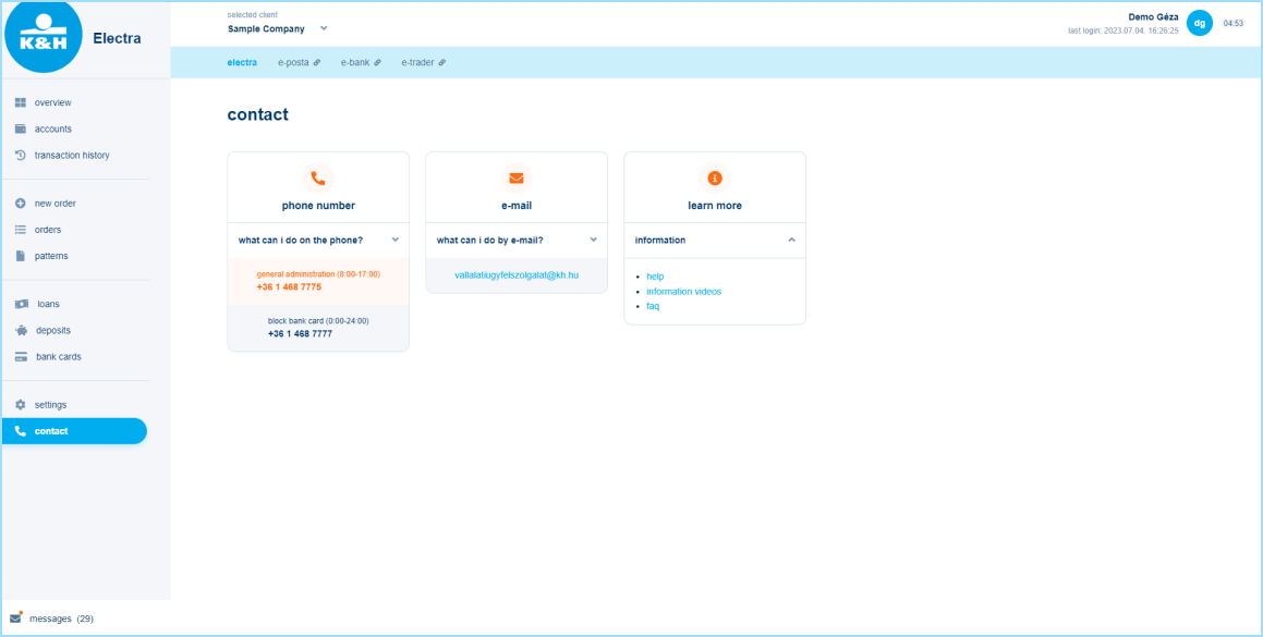
Previously visible at the bottom of the screen, the phone, email contact, other useful information: help (user manual), FAQ, etc. have been moved to the Contact menu item.
messages
This menu item lists the inbox messages received. When there is a new message, a red indicator appears next to the menu item. Notifications related to transactions are not located here, but within Transaction History.
Announcements
* based on the results of a customer survey by an independent service provider
This information does not constitute an offer, its sole purpose is to raise awareness. The Bank reserves the right to modify conditions. For a detailed service description and conditions, please consult the relevant client contract, the General Contracting Terms and Conditions for payment and deposit services provided to corporate clients, the General Contracting Terms and Conditions for Banking Services requiring Electronic Identification, K&H Bank’s Terms and Conditions and the currently effective Announcement for Corporate Clients.


